News
Google Lens Introduces New Light and Dark Themes for Enhanced User Experience
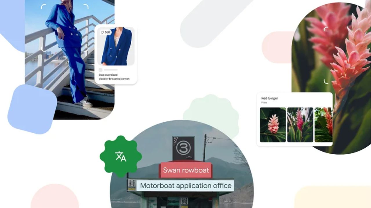
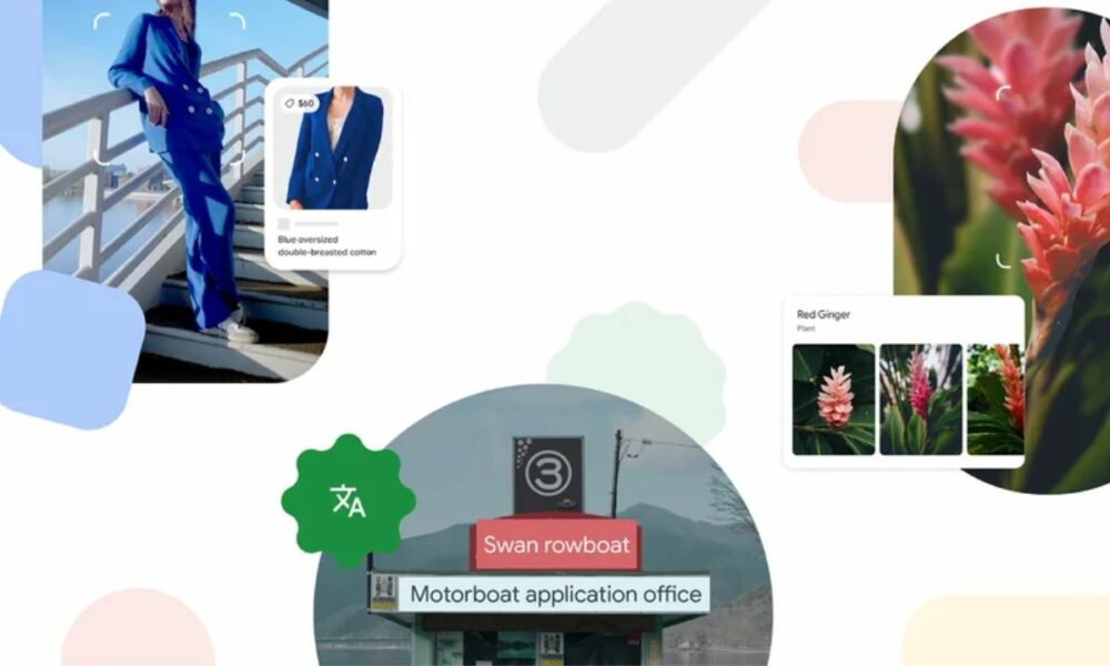
In a bid to enhance user experience, Google has announced the introduction of a new light and dark theme for its popular Google Lens application. Following recent makeovers and updates to various tech-packed applications, the company has turned its attention to refining the Lens experience.
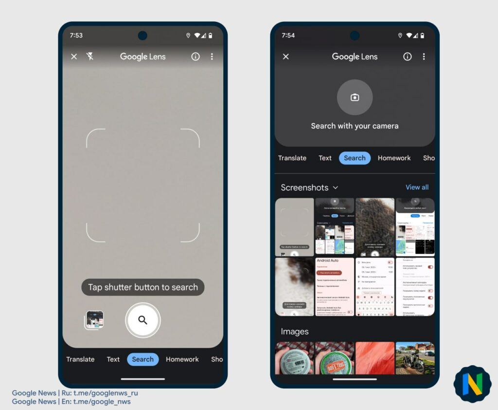
According to reports from a reputable Google News Telegram channel, the tech giant has begun rolling out the highly anticipated light and dark themes for the Lens application. Notably, the longstanding AMOLED-black background will now be replaced with a vibrant white shade, bringing a fresh and modern look to the light theme.
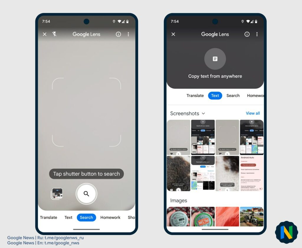
In contrast, users opting for the dark theme will be greeted with a sleek dark grey tone. Additionally, the current page indicator pill will now sport a minimal blue base instead of the previous white color. This subtle alteration indicates that Google is actively laying the groundwork for future dynamic color implementations.
To learn more about these exciting changes, interested individuals can visit Google’s official blog, where the company recently announced a groundbreaking new feature: the ability to search for skin conditions. This innovative addition further demonstrates Google’s commitment to continually improving its Lens application and catering to the evolving needs of its user base.
With Google Lens being a widely acclaimed tool for visual search and information retrieval, these new themes are expected to contribute significantly to the overall user experience. The introduction of the light and dark themes showcases Google’s dedication to providing customization options, allowing users to personalize their interaction with the application.
As the rollout of the light and dark themes progresses, users can look forward to a visually appealing and more enjoyable experience when utilizing Google Lens. With its ability to recognize objects, scan barcodes, translate text, and search for various visual elements, Google Lens continues to empower users in their daily lives.
Google’s commitment to enhancing its applications reflects the company’s continuous efforts to stay at the forefront of technological innovation. As users embrace the new light and dark themes, it is clear that Google’s focus on user satisfaction remains a priority.
Whether users prefer a brighter or darker aesthetic, the introduction of these themes signifies Google’s dedication to providing a versatile and personalized experience for Lens users worldwide.
For More Such Updates Follow Us On – Telegram, Twitter, Google News, WhatsApp and Facebook
Samsung
Galaxy Ring not supported with iPhones – Officially Confirmed
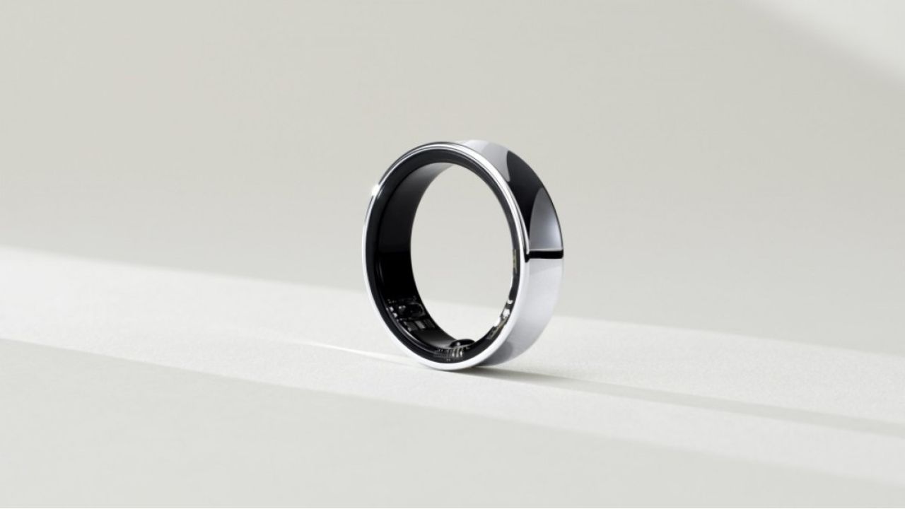
Recently, at the MWC 2024 event, which was held in Barcelona, Samsung’s VP, Hon Pak confirmed that the upcoming Galaxy Ring will not be supported by iPhones. Pak also said that their products are as good as the Apple ones.
There are also very good reasons to switch to Samsung’s ecosystem. Samsung is also working on making their devices compatible with other Android devices as well, not only with their own.
As we already know, Galaxy Ring comes in various sizes. Among them, the smallest one is powered with a battery of 14 mAh, and the largest one comes with a bigger battery of 21.5 mAh which will provide a battery backup of 5-9 days.

Until now, the launch of Galaxy Ring has not been revealed but some rumors suggested that it will launch in the Unpacked Event, which is going to be held in July along with Samsung’s upcoming Galaxy Z Fold 6 and Z Flip 6.
What do think about this move taken by Samsung? Do let us know in the comment box. Also, tell us whether you like this post or not.
For More Such Updates Follow Us On – Telegram, Twitter, Google News, WhatsApp and Facebook
Apple
Is your iPhone or iPad eligible for iOS 18 and iPadOS 18 Update – Here is a list of eligible devices
Every year, Apple announces its new iOS, iPadOS, and MacOS versions in its WWDC (World Wide Developer Conference) which will held at Apple Park in June. This year, Apple will announce iOS 18, iPadOS 18, and MacOS 15. The developer Beta of iOS 18 will be available after the announcement at the WWDC event but if we talk about the stable version of iOS 18 and iPadOS 18 update, then it will be available by September. In this post, we will tell you the list of iPhones and iPads that are eligible for the iOS 18 and iPadOS 18 update.
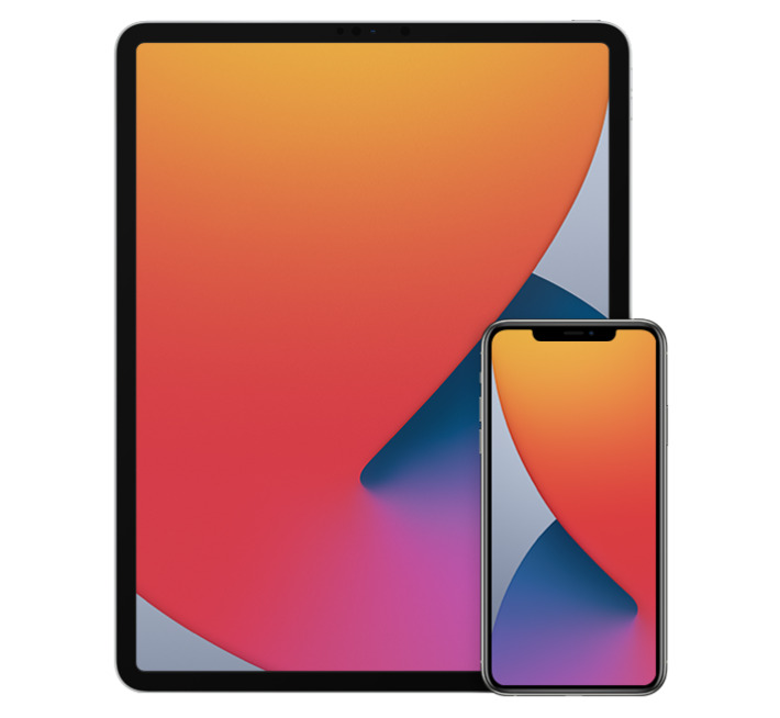
Devices Eligible for iOS 18 and iPadOS 18 Update
First, let’s talk about the list of iPhones, that are eligible for the iOS 18 Update:
- iPhone 15
- iPhone 15 Plus
- iPhone 15 Pro
- iPhone 15 Pro Max
- iPhone 14
- iPhone 14 Plus
- iPhone 14 Pro
- iPhone 14 Pro Max
- iPhone 13
- iPhone 13 mini
- iPhone 13 Pro
- iPhone 13 Pro Max
- iPhone 12
- iPhone 12 mini
- iPhone 12 Pro
- iPhone 12 Pro Max
- iPhone 11
- iPhone 11 Pro
- iPhone 11 Pro Max
- iPhone XS
- iPhone XS Max
- iPhone XR
- iPhone SE (2nd generation)
- iPhone SE (3rd generation)
Now, let’s talk about the list of iPads, that are eligible for the iPadOS 18 Update:
- iPad Pro: 2018 and later
- iPad Air: 2019 and later
- iPad mini: 2019 and later
- iPad: 2020 and later
iOS 18 brings new Generative AI support with Siri, design changes, and RCS message support in Apple’s iMessage. If you want to know more about the features of the iOS 18 update, then we have already created a dedicated post for that, do check that out.
Is your iPhone or iPad eligible for iOS 18 or iPadOS 18 update? Do let us know in the comment box. Also, do tell us whether you like this post or not.
For More Such Updates Follow Us On – Telegram, Twitter, Google News, WhatsApp and Facebook
Apple
Apple has shared full release notes for iOS 17.4 Update along with new Features
Apple, an American-based Tech Giant has recently shared full release notes for the iOS 17.4 update, which is expected to be launched in the first week of the next month i.e. March. If you want to know the upcoming changes or new addons that we get after updating the iPhone to stable iOS 17.4, then we have already posted a dedicated post for that, you can simply check that out by clicking here.
If we talk about them in short, then the upcoming iOS 17.4 update brings major App Store changes in the EU, new emojis, Apple Podcasts transcripts, and an upgrade in the security of Apple’s iMessage. Furthermore, this update also prepares for the launch of the next-generation Apple CarPlay later this year.

As we know, Apple has to follow the EU’s Digital Markets Act. So, to avoid fines, Apple has to roll out the new iOS 17.4 update before the deadline which was given by the EU i.e. 6 March (Wednesday). So, we can expect the iOS 17.4 stable update before or on 6 March. Below listed are the iOS 17.4 U.S. released notes:
Emoji
– New mushroom, phoenix, lime, broken chain, and shaking heads emoji are now available in the emoji keyboard
– 18 people and body emoji add the option to face them in either directionApple Podcasts
– Transcripts let you follow an episode with text that highlights in sync with the audio in English, Spanish, French and German
– Episode text can be read in full, searched for a word or phrase, tapped to play from a specific point and used with accessibility features such as Text Size, Increase Contrast, and VoiceOverThis update includes the following enhancements and bug fixes:
– Music recognition lets you add songs you have identified to your Apple Music Playlists and Library, as well as Apple Music Classical
– Siri has a new option to announce messages you receive in any supported language
– Stolen Device Protection supports the option for increased security in all locations
– Battery Health in Settings shows battery cycle count, manufacture date, and first use on iPhone 15 and iPhone 15 Pro models
– Call Identification displays Apple-verified business name, logo, and department name when available
– Business updates in Messages for Business provide trusted information for order status, flight notifications, fraud alerts or other transactions you opt into
– Apple Cash virtual card numbers enable you to pay with Apple Cash at merchants that don’t yet accept Apple Pay by typing in your number from Wallet or using Safari AutoFill
– Fixes an issue where contact pictures are blank in Find My
– Fixes an issue for Dual SIM users where the phone number changes from primary to secondary and is visible to a group they have messaged
Some features may not be available for all regions or on all Apple devices. For information on the security content of Apple software updates, please visit this website: https://support.apple.com/kb/HT201222
Devices that are eligible for iOS 17.4 Update
At last, if we talk about the eligible devices for iOS 17.4 Update, then iPhone XS and above models are eligible for this update. Whenever you receive the iOS 17.4 update. To update your iPhone, simply head to Settings > General > Software Update.
Are you guys also waiting for the iOS 17.4 stable update? Do let us know in the comment box. Also, tell us whether you like this post or not.
For More Such Updates Follow Us On – Telegram, Twitter, Google News, WhatsApp and Facebook

